Decide what the surface should communicate
A gradient can separate a banner from surrounding content; a shadow can suggest that a panel sits above a background. Neither should be chosen merely to fill an empty area. Write down the intended job first. A confirmation message needs readable text and an unmistakable status label. A decorative hero background has different requirements. This distinction prevents a visually dramatic export from making a useful interface harder to read.
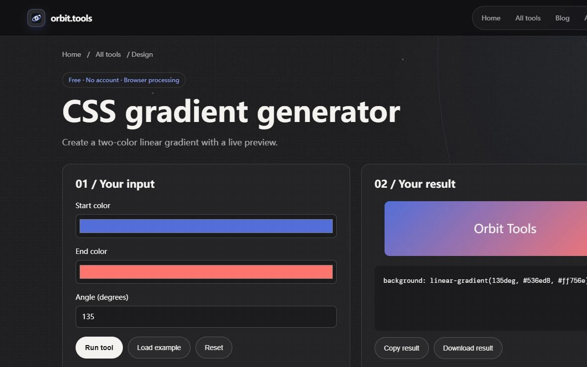
Orbit provides a two-color Gradient Generator and a single-layer Box Shadow Generator. Their outputs are CSS declarations that you apply in your own document. The preview demonstrates one surface in the tool's layout. It cannot know the surrounding colors, clipping rules, content length or typography in your destination. Treat the declaration as a starting value whose meaning must be checked where it will actually be used.
Read the gradient as a direction and two endpoints
Enter two opaque six-digit HEX colors and an angle between zero and 360 degrees. The generator returns a linear-gradient background declaration. An angle of 90 degrees points toward the right in CSS; zero points upward. Use deliberately different endpoint colors for an initial experiment so that you can see the direction clearly. Once the orientation is understood, substitute the intended colors rather than guessing from two nearly identical swatches.
If the destination requires three color stops, transparency, a radial shape or a repeating pattern, this form does not express that request. You can extend the CSS in your own stylesheet, but the resulting design then needs its own inspection. Changing the order of the two colors also changes the visible result. Record the endpoint order and angle together when sharing an approved background, because a pair of color codes alone does not describe the gradient.
Text must work across the region it occupies
A foreground color that passes against one endpoint may fail against the other. Place the actual heading over its real position, inspect the range underneath it and avoid assuming that an average background represents every letter. Contrast Checker accepts two opaque colors; it does not sample the rendered gradient for you. If the text must move freely across the surface, a solid backing surface may make its readability easier to maintain.
Check longer translations, a wrapped heading and a narrow screen even when the current page is English. A heading can shift over a different part of the gradient when its line breaks change. Do not rely on text shadow to rescue a fundamentally weak foreground/background relationship. Decorative depth and readable text serve different purposes and need separate acceptance checks.
Separate offset, blur and spread
Box Shadow Generator exposes horizontal offset, vertical offset, blur and spread in pixels, followed by a color. Begin with offsets of zero, blur of zero and a small positive spread. That produces a hard surrounding edge and makes spread easy to understand. Then set spread back to zero and increase blur. The softened boundary is a different effect from expanding the shadow's size.
A positive vertical offset moves an outer shadow downward; a negative value moves it upward. Negative spread shrinks it. The tool refuses negative blur, because blur radius is not a signed direction. Change one field at a time while learning these relationships. If offset, blur and spread all change together, it becomes difficult to tell which property created the unwanted dark band around a card.
One opaque layer has a deliberate limit
The generator emits a single outer shadow with an opaque HEX color. It does not provide alpha controls, inset shadows or a stack of several shadow layers. On a light page, an opaque dark color can look heavy; choosing a lighter gray is one option within this form. If you later replace that color with a translucent value in your stylesheet, evaluate its composited appearance over the actual destination background.
A shadow can be clipped by a parent container even when the declaration is valid. Check overflow rules and the space around the element before increasing blur to compensate. Similarly, a large soft shadow is not a keyboard focus indicator by itself. Interactive controls need an explicit visible focus treatment, and selected or error states need recognizable labels or shapes rather than decoration alone.
Move the declaration into a real component
Copy the result into the appropriate CSS rule and test a representative card containing a title, paragraph, link and button. Inspect the component in both themes. Dark shadows can disappear against a dark surface, while a bright gradient may compete with the action button. Adjust the role of the effect before adding more effects. A subtle border or a distinct surface color may communicate the boundary more directly.
Finally inspect the component at phone, tablet and desktop widths, including when its text becomes taller. Keep the approved declaration beside a note explaining its purpose and where it was reviewed. The useful output is a coherent component with known behavior, not merely syntactically valid CSS. These generators remove repetitive typing while leaving layout, contrast and visual judgment with the person applying the result.