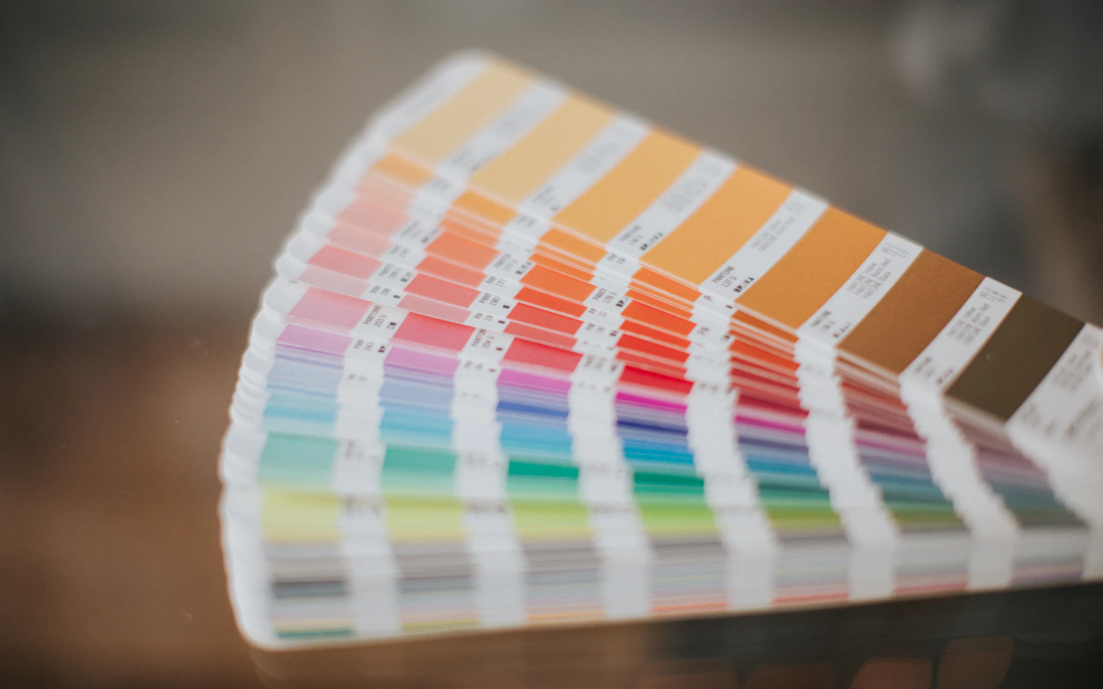
A photograph supplies candidates, not a theme
Palette Extractor samples a reduced image, groups similar channel values and returns approximate frequent colors. It is not a semantic analysis of a photograph and does not identify which color should become body text. A large pale sky can dominate a sample while the small detail that defines the brand barely appears. Use the result as a source of candidates, then choose separate roles for page background, card surface, primary text, secondary text and a deliberate action color.
Palette Generator follows a different rule: for a colored base, it produces five hues spaced around the hue circle; for a nearly neutral input, it offers a neutral scale. This is a predictable exploration aid rather than a certified accessible theme. Color Converter accepts a six-digit HEX input and reports RGB and HSL forms. Neither operation proves that two of its output colors can safely be paired as text and background.
Build a pair matrix with a known control
Begin Contrast Checker with #000000 on #ffffff. The expected ratio is 21:1. Reverse the colors and expect the same ratio, because contrast magnitude is symmetric even though a light interface and a dark interface feel different. Next test identical colors and expect 1:1. These controls help establish what the number means before you start tuning an accent.
Now make a small written matrix for your actual roles: primary text on page, secondary text on card, button label on button and link on page. Repeat the matrix with the dark-theme roles. This checker accepts opaque six-digit sRGB colors, so a translucent label over a gradient cannot be evaluated by pasting the uncomposited token alone. Record the relevant rendered colors instead. The displayed ratio is rounded for readability; the Pass or Fail label uses the underlying value. Near a threshold, rely on that decision rather than rounding an apparent 4.50 upward yourself.
Check contrast on the actual pair
Contrast is a relationship between foreground and background colors. A swatch can look strong by itself and still produce faint text when it is placed on a particular surface. Test the exact pair used in the interface: body text on the page, button text on the button, captions on cards, and links in their default and hover states. If a gradient or image sits behind the text, test the areas where the text actually appears.
WCAG 2.2 Success Criterion 1.4.3 sets a minimum contrast ratio of 4.5 to 1 for normal text and 3 to 1 for large text at Level AA, with defined exceptions. Do not round a result just above or below a threshold. These values apply to text and images of text; other interface graphics and controls have separate guidance. Meeting a ratio is a measurable check, not a guarantee that every person will find the design comfortable.
Build states, not just default colors
Every interactive color needs a state plan. Define how links, buttons, fields, and selected filters look at rest, on hover, when focused with a keyboard, when pressed, and when disabled. Do not communicate a state with color alone. A selected item can also use a border, icon, label, or shape change. A keyboard focus indicator should remain visible against the surface and should not disappear when the pointer is used.
Check common edge cases with the same care as the default screen. A pastel accent on a white surface may fail for small text but work as a broad decorative shape. A muted gray may be appropriate for a border but too faint for a required label. Error and success colors can be difficult to distinguish for some people, so pair them with explicit words or symbols. Test both light and dark themes if the product supports both.
Use tools to measure, then inspect the interface
A contrast checker can calculate a ratio from two color values, which is helpful when you are tuning an accent or documenting a design token. Use the exact hex or RGB values that the browser renders, not a nearby color guessed from a screenshot. If opacity, blending, gradients, or a background image is involved, the final color may be different from the token value. Inspect the actual rendered result in the browser and check more than one part of the component.
Keep a record of approved color pairs beside the tokens or in a small design note. That lets a teammate see why a value was chosen and which text sizes it was checked against. If a shared token changes later, review the dependent pairs again. Avoid treating one successful checker screenshot as permanent proof; context can change when text size, opacity, font weight, or background changes.
A practical palette review
Before handing off a palette, make a simple sample page with a heading, body copy, link, primary button, secondary button, field, error message, and selected card. Try each combination in the page's light and dark themes. Check text at its expected size and weight, and move through controls with a keyboard. This catches problems that a row of swatches cannot reveal, such as a focus ring blending into the button or a link becoming hard to distinguish from body copy.
Then review the palette in the context of the full page and at a narrow viewport. Color can appear different when surrounded by other colors, and a small screen may place content over a different background. Use the checker as a measurement instrument, the browser as a rendering check, and human review to decide whether the result is calm and clear. A successful palette supports hierarchy without forcing color to carry every piece of meaning.